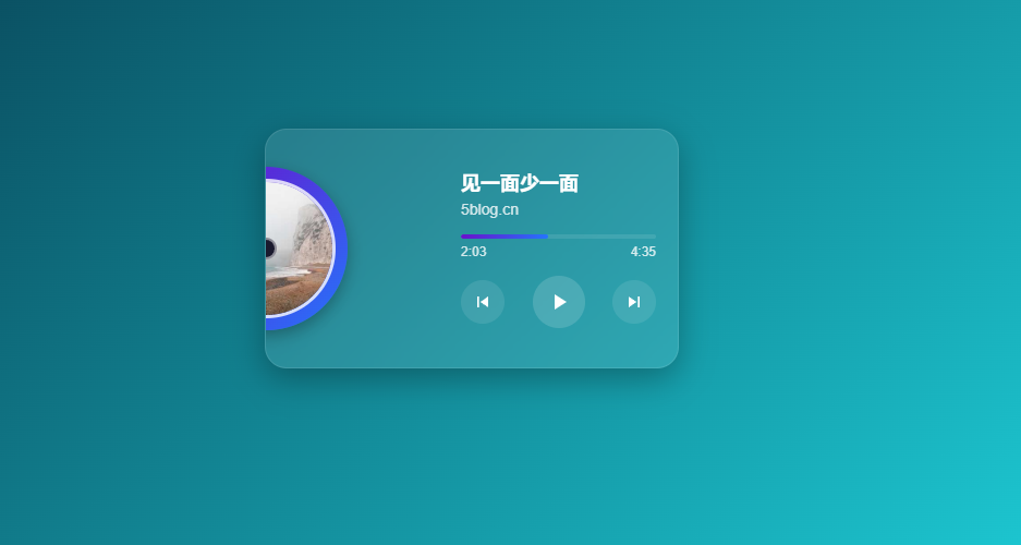
🖤 CD滑动播放器
CD滑动播放器
代码
<!DOCTYPE html>
<html lang="zh-CN">
<head>
    <meta charset="UTF-8">
    <meta name="viewport" content="width=device-width, initial-scale=1.0">
    <title>CD滑动播放器</title>
    <style>
        * {
            margin: 0;
            padding: 0;
            box-sizing: border-box;
        }

        body {
            font-family: 'Arial', sans-serif;
            background: linear-gradient(136deg, #01152b 0%, #24f8ff 100%);
            display: flex;
            justify-content: center;
            align-items: center;
            min-height: 100vh;
            padding: 20px;
        }

        .player-container {
            width: 380px;
            height: 220px;
            background: rgba(255, 255, 255, 0.1);
            backdrop-filter: blur(10px);
            border-radius: 20px;
            box-shadow: 0 10px 30px rgba(0, 0, 0, 0.3);
            padding: 20px;
            position: relative;
            overflow: hidden;
            border: 1px solid rgba(255, 255, 255, 0.1);
        }

        .cd-container {
            position: absolute;
            width: 150px;
            height: 150px;
            border-radius: 50%;
            background: linear-gradient(135deg, #6a11cb 0%, #2575fc 100%);
            box-shadow: 0 5px 15px rgba(0, 0, 0, 0.3);
            top: 50%;
            transform: translateY(-50%);
            left: -75px;
            transition: all 0.6s cubic-bezier(0.25, 0.46, 0.45, 0.94);
            display: flex;
            justify-content: center;
            align-items: center;
            overflow: hidden;
            cursor: pointer;
        }

        .cd-cover {
            width: 85%;
            height: 85%;
            border-radius: 50%;
            object-fit: cover;
            border: 3px solid rgba(255, 255, 255, 0.8);
        }

        .cd-hole {
            position: absolute;
            width: 20px;
            height: 20px;
            border-radius: 50%;
            background: #1a1a2e;
            z-index: 2;
            border: 2px solid rgba(255, 255, 255, 0.5);
        }

        .player-controls {
            position: absolute;
            right: 20px;
            top: 50%;
            transform: translateY(-50%);
            width: calc(50% - 10px);
            color: white;
        }

        .song-info {
            margin-bottom: 15px;
        }

        .song-title {
            font-size: 18px;
            font-weight: bold;
            margin-bottom: 5px;
            white-space: nowrap;
            overflow: hidden;
            text-overflow: ellipsis;
        }

        .artist {
            font-size: 14px;
            opacity: 0.8;
        }

        .time-display {
            display: flex;
            justify-content: space-between;
            font-size: 12px;
            margin-top: 5px;
            opacity: 0.8;
        }

        .controls {
            display: flex;
            justify-content: space-between;
            align-items: center;
            margin-top: 15px;
        }

        .control-btn {
            background: rgba(255, 255, 255, 0.1);
            border: none;
            width: 40px;
            height: 40px;
            border-radius: 50%;
            color: white;
            cursor: pointer;
            display: flex;
            justify-content: center;
            align-items: center;
            transition: all 0.3s ease;
        }

        .control-btn:hover {
            background: rgba(255, 255, 255, 0.2);
            transform: scale(1.1);
        }

        .play-btn {
            width: 48px;
            height: 48px;
            background: rgba(255, 255, 255, 0.15);
        }

        .progress-container {
            width: 100%;
            height: 4px;
            background: rgba(255, 255, 255, 0.1);
            border-radius: 2px;
            margin-top: 10px;
            overflow: hidden;
            cursor: pointer;
        }

        .progress-bar {
            height: 100%;
            width: 0%;
            background: linear-gradient(to right, #6a11cb, #2575fc);
            border-radius: 2px;
            transition: width 0.1s linear;
        }

        @media (max-width: 480px) {
            .player-container {
                width: 340px;
                height: 200px;
            }

            .cd-container {
                width: 130px;
                height: 130px;
                left: -65px;
            }
        }

        @keyframes rotate {
            from { transform: translateY(-50%) rotate(0deg); }
            to { transform: translateY(-50%) rotate(360deg); }
        }

        .playing .cd-container {
            left: calc(24% - 75px); /* 调整到35%位置,更靠左 */
            animation: rotate 10s linear infinite;
        }
    </style>
</head>
<body>
    <div class="player-container" id="player">
        <div class="cd-container">
            <img src="https://picsum.photos/300/300?random=1" alt="CD Cover" class="cd-cover">
            <div class="cd-hole"></div>
        </div>

        <div class="player-controls">
            <div class="song-info">
                <div class="song-title">夜曲</div>
                <div class="artist">周杰伦</div>
            </div>

            <div class="progress-container" id="progress-container">
                <div class="progress-bar" id="progress-bar"></div>
            </div>

            <div class="time-display">
                <span id="current-time">0:00</span>
                <span id="total-time">3:45</span>
            </div>

            <div class="controls">
                <button class="control-btn" id="prev-btn">
                    <svg width="20" height="20" viewBox="0 0 24 24" fill="none" xmlns="http://www.w3.org/2000/svg">
                        <path d="M6 6H8V18H6V6ZM9.5 12L18 6V18L9.5 12Z" fill="currentColor"/>
                    </svg>
                </button>
                <button class="control-btn play-btn" id="play-btn">
                    <svg width="24" height="24" viewBox="0 0 24 24" fill="none" xmlns="http://www.w3.org/2000/svg">
                        <path d="M8 5V19L19 12L8 5Z" fill="currentColor" id="play-icon"></path>
                    </svg>
                </button>
                <button class="control-btn" id="next-btn">
                    <svg width="20" height="20" viewBox="0 0 24 24" fill="none" xmlns="http://www.w3.org/2000/svg">
                        <path d="M16 18H18V6H16V18ZM6 18L14.5 12L6 6V18Z" fill="currentColor"/>
                    </svg>
                </button>
            </div>
        </div>
    </div>

    <script>
        document.addEventListener('DOMContentLoaded', function() {
            const player = document.getElementById('player');
            const playBtn = document.getElementById('play-btn');
            const prevBtn = document.getElementById('prev-btn');
            const nextBtn = document.getElementById('next-btn');
            const progressBar = document.getElementById('progress-bar');
            const progressContainer = document.getElementById('progress-container');
            const songTitle = document.querySelector('.song-title');
            const artist = document.querySelector('.artist');
            const currentTimeDisplay = document.getElementById('current-time');
            const totalTimeDisplay = document.getElementById('total-time');
            const cdCover = document.querySelector('.cd-cover');

            const audio = new Audio();
            let isPlaying = false;
            let progressInterval;

            const songs = [
                {
                    title: "见一面少一面",
                    artist: "5blog.cn",
                    duration: 275,
                    cover: "https://picsum.photos/300/300?random=1",
                    audioUrl: " https://media.xyzcdn.net/ngcw0VFyYxap0YGnNZLNz-Fdg91r.mp3"
                },
                {
                    title: "放弃幻想 准备战斗",
                    artist: "5blog.cn",
                    duration: 244,
                    cover: "https://picsum.photos/300/300?random=2",
                    audioUrl: "https://media.xyzcdn.net/nqCOQa9y0kl1aatrjRABdW21f_VD.mp3"
                },
                {
                    title: "动了情的人 (Live合唱版)",
                    artist: "5blog.cn",
                    duration: 248,
                    cover: "https://picsum.photos/300/300?random=3",
                    audioUrl: "https://media.xyzcdn.net/nueLQIGnadkMdR0GA6RZA_MH_Ppu.mp3"
                }
            ];

            let currentSongIndex = 0;

            function formatTime(seconds) {
                const mins = Math.floor(seconds / 60);
                const secs = Math.floor(seconds % 60);
                return `${mins}:${secs < 10 ? '0' : ''}${secs}`;
            }

            function updateSongInfo() {
                const song = songs[currentSongIndex];
                songTitle.textContent = song.title;
                artist.textContent = song.artist;
                cdCover.src = song.cover;
                totalTimeDisplay.textContent = formatTime(song.duration);

                audio.src = song.audioUrl;
                audio.load();

                if (isPlaying) {
                    audio.play().catch(e => console.log('播放失败:', e));
                }
            }

            function updateProgress() {
                const currentTime = audio.currentTime;
                const duration = audio.duration || songs[currentSongIndex].duration;
                const progressPercent = (currentTime / duration) * 100;

                progressBar.style.width = `${progressPercent}%`;
                currentTimeDisplay.textContent = formatTime(currentTime);
            }

            playBtn.addEventListener('click', function() {
                isPlaying = !isPlaying;
                player.classList.toggle('playing', isPlaying);

                const playIcon = playBtn.querySelector('svg path');
                if (isPlaying) {
                    playIcon.setAttribute('d', 'M6 4H8V20H6V4ZM9 4H11V20H9V4Z');
                    audio.play().catch(e => console.log('播放失败:', e));
                } else {
                    playIcon.setAttribute('d', 'M8 5V19L19 12L8 5Z');
                    audio.pause();
                }
            });

            prevBtn.addEventListener('click', function() {
                currentSongIndex = (currentSongIndex - 1 + songs.length) % songs.length;
                updateSongInfo();
            });

            nextBtn.addEventListener('click', function() {
                currentSongIndex = (currentSongIndex + 1) % songs.length;
                updateSongInfo();
            });

            progressContainer.addEventListener('click', function(e) {
                const containerWidth = this.offsetWidth;
                const clickPosition = e.offsetX;
                const percentage = clickPosition / containerWidth;
                audio.currentTime = percentage * (audio.duration || songs[currentSongIndex].duration);
                updateProgress();
            });

            audio.addEventListener('timeupdate', updateProgress);
            audio.addEventListener('ended', function() {
                nextBtn.click();
            });

            updateSongInfo();
        });
    </script>
</body>
</html>
演示地址
阅读:70
发布时间: